Sysiphos in search of a UI framework
It’s the year 2019 and for reasons beyond this post, the author is looking for a cross-platform desktop GUI framework. John Novak’s “Cross-Platform GUI Toolkit Trainwreck, 2016 Edition” contains a big list of options with his own opinion. I valued his openness on the aesthetic qualities of the different GUIs. It surprised me that there are actually so many options, even though I could rule out most of them quite quickly. I don’t have any really special requirements, I’d say, but still, most frameworks didn’t meet them.
What I want
My ideal GUI framework has to:
- Run on Linux, macOS X, Windows and possibly FreeBSD
I don’t have the resources to re-build the UI three times. - Be accessible from C++, since my application’s core is C++
- Doesn’t use a low-level C interface
I found old-school C interfaces often very verbose, compared to a tidy C++ interface. Also, from my perspective, GUIs benefit a lot from object-oriented design. That’s not natively possible in C, leading to more boiler-plate code. I like my code dense. - Widgets should look and feel native
My application probably won’t sell in the millions. Thus users benefit from applying platform UI concepts to the application. If it behaves like all the small applications, it’s good. In a positive sense. - It feels good
Extending on the native look and feel, widgets have to offer the complex UI behaviour that people are subconsciously used to. If a widget looks like a text field, it should better behave like one and support all the anemities like Input Method Editor (IME) support or spell-checking. - It looks good
OK, now we’re getting into the subjective territory that John Novak didn’t shy away from. Extending on the native look and feel, the GUI toolkit should provide a consistent look. Also, that look should not be totally oldfashioned. I personally enjoy thinking back at CDE, the Commmon Desktop Environment, and Motif. But people won’t perceive that look as contemporary. Working in a user-centred fashion, I do think about how people will perceive my artifacts. My target audience is used to custom looks, but it will frown upon something that e.g. would use sub-standard text rendering. It can be embedded
My application should also run as a plug-in. But even finding out whether a certain GUI framework can run from a library inside some other host process and if that won’t break in the future, was hardly possible. Thus, I dropped the requirement.- It offers a decent set of widgets
Meaning: Windows, labels, text fields, menu bars, icons, list of arbitrarily composed widgets, context menus, scroll areas. - Widgets have rich semantics
Standard behaviour such as Drag&Drop should be supported. You can drasticly simplify a framework by leaving some of the latter out. But why would I use a framework that doesn’t support any of these? The whole point of using a framework is to save me from reinventing the wheel. If a frameworks offers nothing more than a drawing canvas and basic I/O, I can also use OpenGL, Win32 or Cairo directly. - The documentation is good or the API/code is easy to understand
I don’t want to become an expert on a single GUI framework and its quirks. I’m already far too deep into Win32. - More liberal license than LGPL
My application is not planned to be open-sourced. But also, I don’t plan a big commercial success. That rules out most commercial licenses. The LGPL is a tricky beast, so I’d like to avoid that, too. (Spoiler: I couldn’t) - It is used by a decently-sized application under active development
Some design mistakes turn into road-blocks only in complex applications. I am spoiled by rich GUIs, so working with a bare-bones system would invoke the Not Invented Here Syndrome. Also, if no-one picked up a framework, maybe there’s a reason why. It’s sad if there would be a really good framework out there and everyone ignored it by following the same reasoning as me, but I have to cut scope. I can’t evaluate 50 frameworks in-depth.
Also, as a bit of background:
For my employer, I extended, improved and revamped parts of our internal GUI framework that is used
in a famous Digital Audio Workstation (DAW). In my team, we spent weeks to improve drop-downs and
context menu to feel right. That’s why I knew that there is a ton of small details you can leave
out to simplify the GUI logic. But going the whole way brings you from “it looks OK” to “it feels
awesome”. If the details are missing or the behaviour doesn’t make any sense, it’s a nuisance to the
user. It wastes time, valuable mental resources and might even pull people out of their (creative)
focused mental state. If that happens, we didn’t do our job well. Our users should immerse in their
music and our DAW. It helps if widgets behave in a consistent way, consistent to other widgets,
maybe the platform and their looks. Since I’m not a UI designer, I’ll stop here.
Recurring theme: Use Qt!
Talking to others about this topic, I got the same reply multiple times:
Then, why don’t you just use Qt?
Well … I have a heart for all the underdogs. That’s why I didn’t just want to go with the most obvious, supposedly easy and huge option. Also because it adds a whopping 15 MB to your application. I am also remotely familiar with the size of the Qt bug tracker and the probability of getting a bug fixed, or even upstreaming a bugfix. The framework is complicated enough that I can’t maintain it myself. It’s so complicated that I certainly couldn’t even fix bugs in the guts, e.g. in the render backends, myself. This is something that I would like to avoid.
Let’s consider some other contenders first. I ruled out a lot of optioned with my requirements stated above. Also, I found some frameworks that sound good, but under the hood, it’s either a dead project or a one-man show and no application from after 2000 ever used the framework.
FLTK: Look vs. Feel
The first framework I had to look at is FLTK 1.3.5. Fast, Light, Framework: That pushes all my buttons!
I appreciate how small the framework is. Yet, they massively cut scope. This is fine, if it suits
your application. To change the looks, it offers three skin theme schemes:
- Standard/“Native”, which looks a bit too minimalistic to me If Windows 95 would just have been released, we could go with that.
- Plastic looked better, as if it was heavily inspired by the early bubblegum macOS X. But for my taste, it’s a bit too much bubble gum.
- GTK+ looked reasonable. Borderline too round, but ah well. Let’s go with that.
Unicode support
Skimming through the documentation, some alarm bells ring:
Unicode support was only recently added to FLTK and is still incomplete.
Uh-oh. Having implemented IME support on Windows, Emoji support and other things, I know that Unicode text support is a beast. If I can, I’d avoid anything related to text. It’s a bottomless pit of nested rules and exceptions to those rules. Also as a GUI framework developer, if I could, I’d very seriously try to avoid this. The casual reader can think about the implications of the text direction (left-to-right or right-to-left) on a UI layout.
Trying out some widgets, I quickly found a bug in FLTK’s IME handling. But my dear Umlauts worked in text labels and text fields. As a German, that’s what I care about first. ;)

You have mixed tabs and spaces
I consider this a code smell. Unfortunately, a code smell I see far too often.
I appreciate if a GUI framework has an example application that showcases their widgets and capabilities. FLTK has such an application, let’s check it out.
Widget showcase: Fl_Choice
At first, I mistook Fl_Choice for a combo box, because it looks like one. Quick recap: If collapsed, a combo box shows the chosen element out of a list of elements. Normally, if clicked, the user can edit the element and/or the (drop-down) list of possible entries unfolds for the user to choose an entry from that list.
Which widget would be better suited for an assessment than a combo box? None, because I spent weeks on refining the behaviour of our combo boxes at work! The combo box should also behave fine when the list of entries is too long to fit on screen (make it scrollable, for example) and should never ever extend outside of the screen. But it makes sense to extend the list outside of the application window. It’s close to a context menu, but care has to be taken to position it appriately so that it feels like a drop-down and not like a context menu.
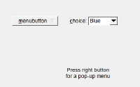
Let’s select the “Standard” scheme. Then, there is a “menu button”, that looks like this:
This is exactly what the name says: Something that opens up a menu if clicked. It doesn’t display
a selected option. That’s not what I wanted, but the behaviour is consistent with what I see.
Let’s go for the FL_Choice widget you see to the right. That should be our combo box,
exactly like the “menu button”, but it displays the currently selected option. Well, until you
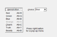
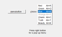
click it. Then, this happens:
It’s not a drop-down, but a NeXT/macOS-style pop-up button! Reading the documentation
would have helped here. It clearly states that Fl_Choice is:
A button that is used to pop up a menu.
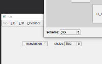
OK, fine. I have never needed something like that. Anyway: Why does it show a down-arrow?! I found myself confused. But the confusion can be solved by changing the scheme to “GTK+”: Look, the collapsed widget for selecting the scheme now gained a second arrow! Well, with the double-arrow, I’m not surprised about the behaviour anymore. Just … why is the look so inconsistent between schemes?
Small ≙ NIHS
Being small means you have to cut corners. For example:
- There is no drop-down, just the “button with pop-up menu” that is more complicated and simple at the same time.
- This also means you have to add an “&” to an entry’s title to make it selectable by keyboard (”&foo” -> press “f” to go to foo). Out of the box, standard behaviour like selecting an entry by typing the start of the entry’s text does not work.
- Having multiple entries with the same hot key is not really supported. Pressing that key multiple times will always go to the same entry, not jump between entries.
- Menus,including drop-downs, stick out of the screen if they get too long.
the looks
All in all, easily found inconsistencies, coupled with not being the prettiest UI framework and offering only a bare-bones set of features let not consider FLTK further for this project. Nonetheless, if you’re searching for a small, classic (from the API perspective!) UI framework, it’s certainly something to consider!
MFC reincarnation: wxWidgets
Ah, good old wxWidgets! Old, proven and taking a route that I thought I’d like: Using native widgets instead of reinventing the wheel. Bonus points for often providing a native look on different platforms. That’s the kind of underdog that I like: It’s not popular, but capable. It is used by complex applications like Kicad.
Looking into their examples, I thought I’d look at MFC (Microsoft Foundation Classes) code. But no, I just looked at a framework that was very closely modeled after MFC, including the static event dispatch tables. MFC is so dated that I’d not seriously consider a framework that only offered this style. Guess what, they added support for dynamic event bindings a long time ago. Just noone ever modernised their vast collection of examples. Yes, they have a lot of examples, which is very appreciated! But not showing how to use the framework in a modern way makes it harder to attract users. Just to be clear: In wxWidgets, you can bind a Lambda to an event. It’s just not prominently mentioned in the examples.
The widget list is very extensive, dokumentation is good, there is also a wiki. I clicked around
in their widget showcase application, and then I saw this:
 I couldn’t believe my eyes. It’s 2019 and a UI flickers! I mean, I have seen this since Windows 95,
but even back then it wasn’t that extreme. At least in my memory. ;) There is even a
wiki article on this. Descibing a long history of
failed and successfull attempts and measures to fix this issue. Hint: Enabling double buffering on
the tree widget helped. Just why exactly isn’t this the default? Why do I have to set this on some
widgets and not on others? That didn’t leave a good taste.
In general, it’s quite clear that wxWidgets doesn’t seem to be a popular choice for new applications. I think it gets the job done and offers a good balance between native looks, being easy to use and providing a big feature set. Yet, in the end, I couldn’t imagine using wxWidgets for my application. It just wasn’t the right match.
Honourable mention: JUCE
JUCE is a framework specialized on creating real-time audio plug-ins and applications. The framework makes it really easy to create your own audio plug-in or stand-alone program. It offers the whole package: I/O abstraction, GUI framework, DSP building blocks, persisting settings and so on. Sounds good, doesn’t it? That’s why you have to pay for it, unless you’re a non-profit or your company only does little profit. I found their licensing to be a bit too strict in the lower tiers, that’s why I didn’t go for it.
From my perspective, the GUI framework is one of the best parts of JUCE:
It is a classic 90-style GUI framework, backed by a software renderer. That gives you a consistent
look and feel across platforms, which most people prefer for their cross-platform plug-in-ins.
The framework went from using classic C++ interfaces to supporting C++ STL lambdas for
callbacks, via std::function. So you can use it in a more “modern” way, if you prefer that.
The framework also has some clever concepts, e.g. to easily position widgets manually. Yet, it’s
still very bare-bones. For example, there is no dynamic layouting system. It is clearly focused on
audio plug-ins, which follow their own rules on UI design. That area has been one of the last
strongholds of skeudomorphism, for example.
Last but not least, the documentation is quite good on this framework!
Qt, again
Well, having run out of options, I gave Qt a try. A try, not a quick try: The installation with
libraries, sources and debug symbols takes 10 GB on my hard drive, split amonst 260’000 files.
Also, it installs in a non-standard location: C:\Qt.
Also, because of the license, I have to now link my application dynamically, which I otherwise
wouldn’t do on Windows.
Nonetheless, I found working with Qt remarkably easy. With the excellent documentation and examples, I got up to speed quite quickly. You’re just slowed down every time you want to use something else than a Qt: Integrating the two worlds creates the usual integration issues of having different paradigms and data types. I did not want to embrace Qt fully to still make use of my project without its UI.
Instead of piping all my files through MOC, I use verdigris, a C++-based metadata generator. I don’t know if that’s worth it, but it simplified my build process.
Apropos build process: Oh dear, every time I compiled a Qt application, I wondered why this takes
so long. Same for my application. It’s small, yet compiling takes many seconds. That approach create
a separate header for each (UI) class really increases compile time a lot. Add the huge Qt and C++ STL
headers, fast compilation like in C is impossible. Or is it? Turning on unity builds, which bundle
many .cpp files into one so that the compiler has to only preprocess headers once for the unity
file, makes compile times much more bearable. So much that I can’t understand how people can develop
C++ without. If only a single file is rebuilt continuosly, that’s fine. But if you ever iterate on
a core class and have to recompile the whole code base many times, for example because you try out
different hypotheses and run benchmarks, not having unity builds makes such studies prohibitively
expensive. That’s why they either don’t happen or require brighter people with less need for
recompilation. Anyway, I’m digressing.
Qt is an all-encompassing platform. That’s a benefit, because it already offers almost anything you could ask for. You get the advantage of e.g. having a thread subsystem integrated with the event subsystem. Thus, you can easily pass messages between threads which arrive just at the right moment. Marshalling and scheduling is handled by Qt. Try to do this in barebones C++, for comparison! The flipside of the coin is that it’s harder to integrate with other parts, because it does many things in its own way. That can also be a good thing, I won’t judge this.
Summary
To all toolkit developers: Thank you for providing demo programs that showcase your toolkit! They are very helpful. But please keep them up to date! Showcasing an outdated style of using a framework or using outdated UI paradigms isn’t the best invitation to use it. It’s mainly these demos that I look at when evaluating a framework. For instance, I really liked the Qt examples.
The state of cross-platform GUI toolkits in 2019 is still dire, if we take my requirements into account. This is exacerbated by the fact that many applications don’t even try to use native widgets and roll their own, with all the associated pain of “Not Invented Here”. On the other side, the two commercial OS vendors didn’t show a lot of intrest in providing easy access to their modern native widgets and UI paradigms, too. This changed recently with Microsoft giving access to their UWP controls via XAML islands to desktop applications.
Sadly, this means that if you want to quickly create a small application as a single person, your options left are:
- Abandon cross-platform support
- Accept reduced user convenience and go for a small framework like FLTK.
- Use a huge framework like Qt (What’s 15 MB of added binary size ;))
- Abandon the idea of a desktop application, switch to a browser or Electron.
This idea is really worth considering! Browsers solve many of the annoying problems of a GUI framework for you, like text entry and text display. They “just work” and are amazingly fast. Also, there is a huge pool of people who can work in this area. Compared to this, desktop software is a dying field. Except the obvious waste of resources:libcef.dll, the Chromium Embedded Framework, is over 50 MB in size, for example. I’d consider this overkill for my few 10’000 lines of code.
That’s why I went for Qt. It seemed like the best compromise. Also, that way I could try out how their Signal/Slot system.
